(Don’t speak German? English version below)
Die Spannung auf das WordCamp Deutschland 2023 steigt täglich und mit ihr die Freude über die kreative Kraft, die dem Herz des Events Leben einhaucht: das Design. Ein wohl überlegtes, ansprechendes Design ist mehr als nur eine Augenweide. Es verkörpert das Wesen unserer Gemeinschaft und heißt jede:n willkommen, Teil dieses inspirierenden Abenteuers zu sein.
In diesem Beitrag lüften wir den Vorhang zur Entstehung des Designs des WordCamp Deutschland 2023. Begleite uns auf dieser faszinierenden Reise von der ersten Idee bis zur finalen visuellen Identität und erlebe die Leidenschaft und das Engagement, das unser Team in die Schaffung eines unvergesslichen Erlebnisses gesteckt hat.
Gemeinsame Vision durch thematische Gestaltung
Das Thema eines Events ist nicht nur kreativer Ausdruck, sondern der rote Faden, der sich durch jedes Detail zieht, eine unverwechselbare Identität schafft und ein unvergessliches Erlebnis formt. Im WordCamp Deutschland 2023 diente das Bauhaus-Design als lebendiger Leitfaden, der Aussehen, Verhalten und Kommunikation formte. Dieses Thema war mehr als eine ästhetische Wahl. Es baute die Brücke zwischen der traditionsreichen deutschen Designkultur und der zukunftsorientierten WordPress-Gemeinschaft.
Die Reise zum prägnanten Thema begann mit einer intensiven Brainstorming-Session, angeführt von unserem Design-Team Lead Hendrik. Eine Palette von Themenvorschlägen wurde präsentiert und diskutiert: die mystische Welt der Grimms Märchen, die klassische Eleganz des Bauhaus Designs, eine humorvolle mittelalterliche Gutenberg-Party und die heroische Nibelungensage. Trotz der Beliebtheit der Grimms Märchen zog das Organiser-Team das Bauhaus Design vor, da es eine klare Linie zwischen Tradition und Moderne zog. Diese Entscheidung entstand nicht leichtfertig, sondern war das Ergebnis tiefgehender Überlegungen und leidenschaftlicher Diskussionen, die die Bedeutung des Themas für das gesamte Event unterstrichen.
Von der Idee zur Visualisierung
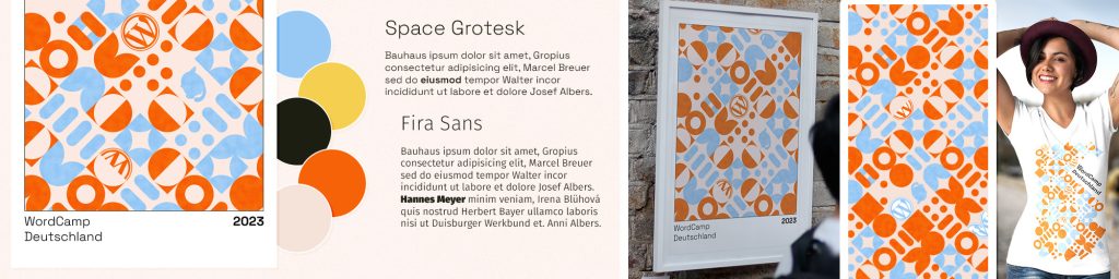
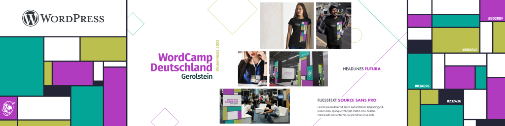
Die Reise zur visuellen Umsetzung des Bauhaus-Themas nahm ihren Anfang mit unserem Design-Team: Marius, Andreas, Benjamin und Thomas. Ihre erste Aufgabe: die Entwicklung von Stylescapes. Diese visuellen Moodboards, eine Zusammenstellung von Design-Elementen, Farbpaletten und Typografien, spiegeln verschiedene Interpretationen des Bauhaus-Themas wider. Jedes Teammitglied investierte Zeit und Kreativität, um individuelle Stylescapes zu gestalten, die die Vielfalt des Bauhaus-Themas und die mögliche visuelle Richtung des WordCamp Deutschland 2023 darstellten.
Besonders Marius‘ Stylescape beeindruckte und wurde daher vom Orga-Team als Grundlage für die visuelle Identität des WordCamp Deutschland 2023 auserkoren. Sein Stylescape präsentierte eine klare, minimalistische Designrichtung, die gut mit den Prinzipien des WordCamp Deutschland harmonierte.
Die Fusion von Bauhaus und WordPress
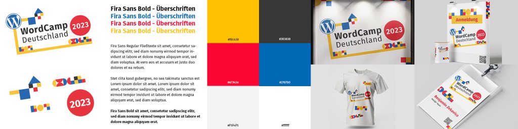
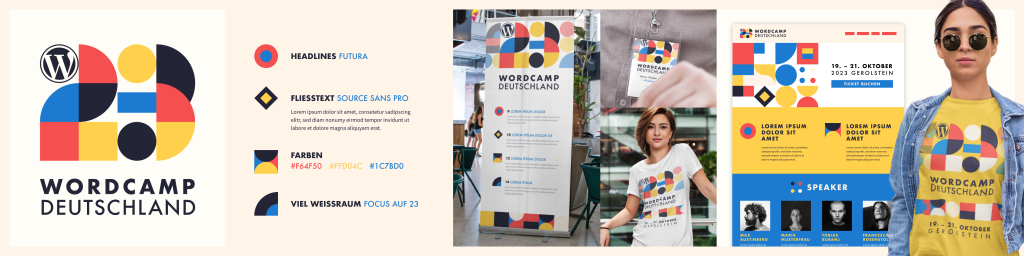
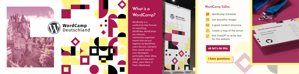
Die Typografie-Auswahl läutete die Umsetzungsphase ein. „Jost“ für die Überschriften, inspiriert von den deutschen Sans-Serifs der 1920er, schafft eine ästhetische Verbindung zum Bauhaus. Für den Fließtext wählten wir „Fira Sans“ aus der Berliner Typefoundry Carrois und dem Typografen Erik Spiekermann, berühmt für ihre Lesbarkeit, um klare Kommunikation zu gewährleisten.
Unsere Farbpalette, eine Hommage an die traditionelle Bauhaus-Farbpalette, umfasst die Primärfarben Rot, Gelb und Blau, ergänzt durch Creme-Weiß und Off-Schwarz. Diese Farbkombination schafft nicht nur eine visuell ansprechende und einladende Atmosphäre, sondern die hohen Kontraste dienen auch der Barrierearmut und sollen eine gute Lesbarkeit fördern.
Das Kern-Visual, ein geometrisches Muster aus Kreisen und Rechtecken, repräsentiert die Bauhaus-Philosophie von Form und Funktion und dient als Grundlage für nahezu alle weiteren Designanwendungen des WordCamp Deutschland. Die vielfältigen, spannenden Muster schaffen eine dynamische, strukturierte visuelle Landschaft.
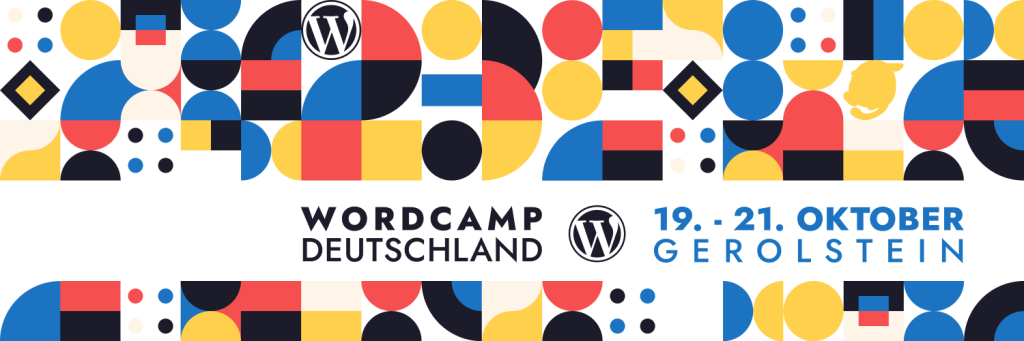
Das von Marius kreierte „23“-Logo integriert diese geometrischen Formen auf innovative Weise. Die „23“ ist kunstvoll in das Muster eingebettet und auf den zweiten Blick sichtbar, während das WordPress-Logo die starke Verbindung zur Community symbolisiert.
Der von Thomas entworfene Wapuu nimmt diese geometrischen Formen auf, verkörpert die freundliche WordPress-Community und reflektiert die Bauhaus-Ästhetik sowie die Herzlichkeit der Community in jedem Element, von seiner Form bis zu seiner Farbpalette.
Ein Dankeschön
Die Gestaltung des WordCamp Deutschland 2023 war eine inspirierende und lehrreiche Reise, die die Bedeutung von Teamarbeit und kreativer Kollaboration eindrucksvoll unterstrich. Ein herzlicher Dank geht an unser engagiertes Design-Team: Hendrik, Marius, Andreas, Benjamin und Thomas. Ihre kreativen Visionen, ihr unermüdlicher Einsatz und ihre Liebe zum Detail haben eine markante visuelle Identität geschaffen, die das Erbe des Bauhaus eindrucksvoll ehrt und die dynamische Gemeinschaft von WordPress feiert.
Wir hoffen, dass dieses durchdachte und liebevoll gestaltete Design bei allen Teilnehmer:innen Anklang findet und eine Atmosphäre schafft, die zum Lernen, Teilen und Vernetzen anregt. Wir sind voller Vorfreude, diese visuelle Reise mit der gesamten Community zu teilen und freuen uns auf die gemeinsamen Erlebnisse, die uns beim WordCamp Deutschland 2023 erwarten. Bis dahin möge die Vorfreude und die Gemeinschaft der WordPress-Community uns alle begleiten und inspirieren.
About the design of WordCamp Germany 2023
The excitement for WordCamp Germany 2023 increases daily, and with it the joy about the creative force that breathes life into the heart of the event: the design. A well-considered, appealing design is more than just a feast for the eyes. It embodies the essence of our community and welcomes everyone to be part of this inspiring adventure.
In this post, we pull back the curtain on the creation of WordCamp Germany 2023’s design. Join us on this fascinating journey, from the initial idea to the final visual identity, and experience the passion and dedication our team put into crafting an unforgettable experience.
Shared Vision Through Thematic Design
The theme of an event is not just creative expression, but the common thread that runs through every detail, creating a distinctive identity and shaping an unforgettable experience. At WordCamp Germany 2023, Bauhaus design served as a living guide that shaped appearance, behavior and communication. This theme was more than an aesthetic choice. It built the bridge between the traditional German design culture and the forward-thinking WordPress community.
The journey to the concise theme started with an intensive brainstorming session, led by our design team lead Hendrik. A range of theme suggestions were presented and discussed: the mystical world of the Grimms Fairy Tales, the classic elegance of Bauhaus design, a humorous medieval Gutenberg party, and the heroic Saga of the Nibelungs. Despite the popularity of the Grimms Fairy Tales, the organizing team preferred Bauhaus design because it drew a clear line between tradition and modernity. This decision did not come lightly, but was the result of deep thought and passionate discussion that underscored the importance of the theme for the entire event.
From idea to visualization
The Bauhaus theme visualization story started with our design team: Marius, Andreas, Benjamin and Thomas. Their first task: the development of stylescapes. These visual mood boards, a compilation of design elements, color palettes and typographies, reflect different interpretations of the Bauhaus theme. Each team member invested time and creativity to create individual stylescapes that represented the diversity of the Bauhaus theme and the possible visual direction of WordCamp Germany 2023.
Marius‘ stylescape was particularly impressive and was therefore chosen by the Orga team as the basis for the visual identity of WordCamp Germany 2023. His stylescape presented a clear, minimalist design direction that harmonized well with the principles of WordCamp Germany.
The Bauhaus and WordPress merger
The typography selection launched the implementation phase. „Jost“ for the headlines, inspired by the German sans-serifs of the 1920s, creates an aesthetic link to the Bauhaus. For the body text, we chose „Fira Sans“ from Berlin-based typefoundry Carrois and typographer Erik Spiekermann, famous for its legibility, to ensure clear communication.
Our color palette, an homage to the traditional Bauhaus color palette, includes the primary colors of red, yellow and blue, complemented by cream white and off-black. This color combination not only creates a visually appealing and inviting atmosphere, but the high contrasts also serve to reduce barriers and are intended to promote good visibility.
The core visual, a geometric pattern of circles and rectangles, represents the Bauhaus philosophy of form and function and serves as the basis for nearly all other design applications of WordCamp Germany. The diverse and exciting patterns create a dynamic, structured visual landscape.
The „23“ logo created by Marius integrates these geometric shapes in an innovative way. The „23“ is artfully embedded in the pattern and visible at second glance, while the WordPress logo symbolizes the strong connection to the community.
Designed by Thomas, Wapuu embraces these geometric shapes, embodies the friendly WordPress community, and reflects the Bauhaus aesthetic as well as the warmth of the community in every element, from its shape to its color palette.
A Big Thank You
Designing WordCamp Germany 2023 was an inspiring and educational journey that vividly highlighted the importance of teamwork and creative collaboration. A heartfelt thank you goes to our dedicated design team: Hendrik, Marius, Andreas, Benjamin, and Thomas. Their creative visions, tireless efforts, and attention to detail have created a distinctive visual identity that impressively honors the legacy of Bauhaus and celebrates the dynamic WordPress community.
We hope that this thoughtful and lovingly crafted design resonates with all participants and creates an atmosphere that inspires learning, sharing, and networking. We are eagerly looking forward to sharing this visual journey with the entire community and anticipating the shared experiences awaiting us at WordCamp Germany 2023. Until then, may the excitement and unity of the WordPress community inspire us all.
Schreibe einen Kommentar